Hello there,
Welcome back to my newsletter for a new adventure, Today, get ready for a fascinating journey that will make you see the world in a whole new light. Did you know that the maps we use to understand our planet aren't as straightforward as they seem?
Throughout our lives and during our school days, we've come across this specific map that we've grown accustomed to. If I were to ask you which countries appear larger on this map, you might mention Russia, Greenland, Canada, Brazil, and Argentina, thinking they are bigger than others. However, here's an astonishing fact: the actual size of Greenland is the same as that of India. I can imagine you might find this hard to believe, considering the picture above clearly shows Greenland as a much larger nation than India. Today, let's dive into a discussion about world maps and explore this intriguing topic further.
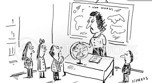
500 years ago, in 1569, a German Cartographer named Mercator introduced a map projection that we still use today. It's called the Mercator projection. At that time, people already knew that the Earth is not flat but a globe (I hope all of you reading this newsletter are not flat earthers, but just in case you have any doubts, I'm attaching an image that will clarify things for you).
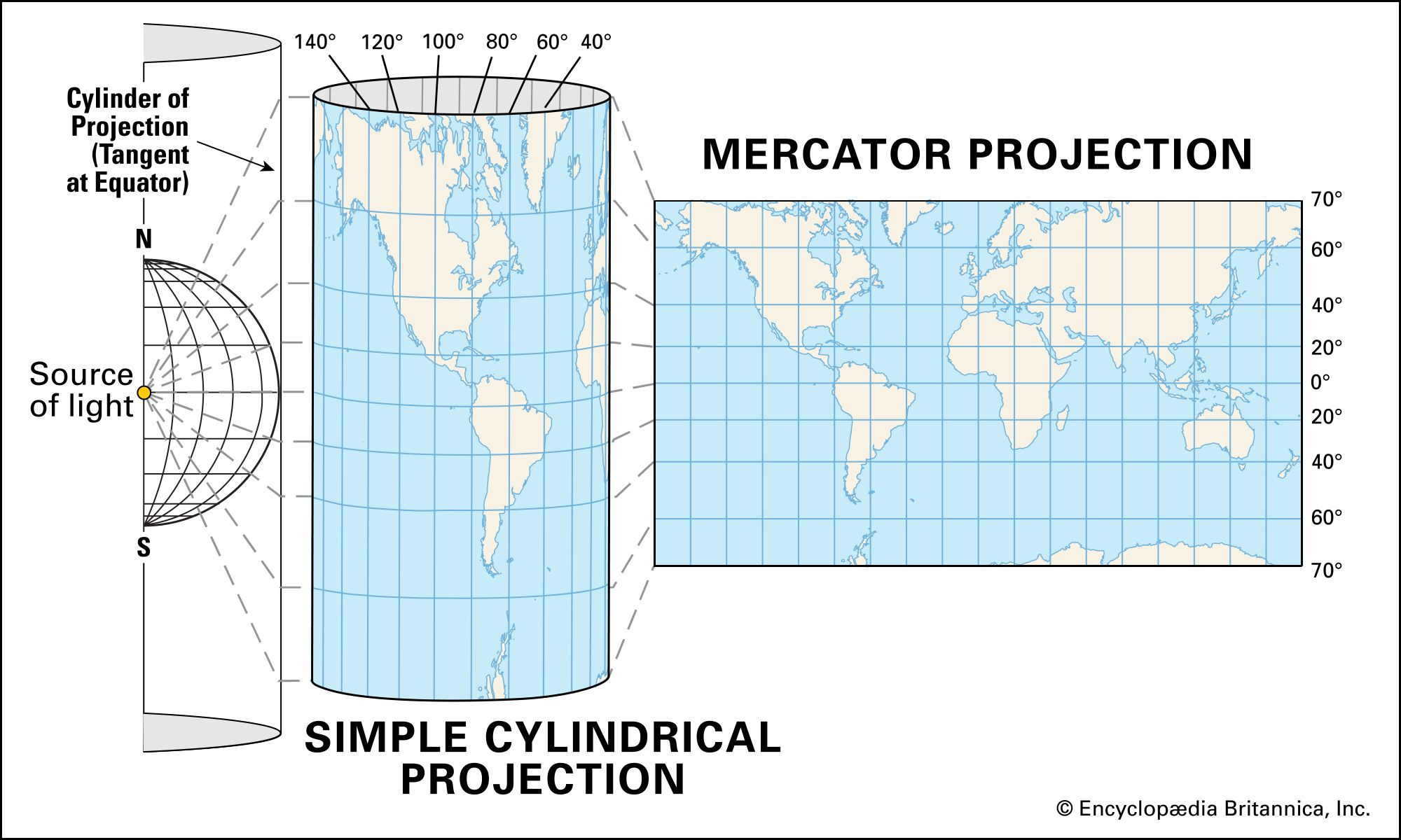
The reason Mercator created this projection was to help sailors navigate more easily. You see, when ships were sailing across the oceans, they faced challenges in determining the correct directions. So Mercator came up with a clever idea. He first transformed the globe map into a cylinder shape, and then he shone a light from one source. Using this light and some calculations, he converted the cylindrical map into a rectangular map.
This Mercator projection became popular because it accurately represented the directions, making it easier for sailors to plan their routes. However, there was one problem with this map: it distorted the sizes of countries as they moved away from the equator. This means that countries closer to the poles, like Greenland, appeared much larger on the map than they actually are.
To gain a deeper understanding, you can visit a website called "The True Size"(link) This website allows you to visualize the true size of different nations. Let me demonstrate this practically by using the example of Greenland and India.
By simply entering the name of a country (let's use Greenland for our example) into the website, you can see how the countries located in the northern regions appear when brought closer to the equator. This allows you to visualize the true size of each nation.
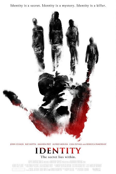
Alright, let's dive into our much-awaited segment of recommendations, where I bring the juiciest bits of entertainment. And my first recommendation is none other than the mind-bending thriller, "Identity" from 2003. Get ready for a rollercoaster ride of suspense and intrigue as a group of strangers find themselves trapped in a remote motel during a storm. But here's the twist: they soon realize that they share a dark and deadly connection that will keep you guessing till the very end.
Feeling bored and looking for a quick cure? Look no further than the Bored Button website! It's your ultimate boredom-busting companion that guarantees endless entertainment with just a click. When you visit Bored Button, you'll find a simple yet captivating concept. Each time you click the button, it transports you to a random fun and interactive website or game, ensuring that boredom never stands a chance.
link: (www.boredbutton.com)
As we wrap up, Listen to the uplifting song "Happy" by Oh Wonder, because nothing boosts spirits quite like a good melody. If you've enjoyed reading this edition, please leave a like and share your thoughts. I'll be back next weekend with another exciting edition to satisfy your curiosity and keep you motivated.
Until then, stay curious, stay motivated, and keep exploring the wonders of the world. Wishing you all a fantastic week ahead!


damn i was lied to this whole time?